REVIEW SOME OF YOUR IMAGES AND COMMENT ON THEIR BALANCE
A brief analysis of the balance in some of my images

The balance of this image is caused by the contrast between the rounded shapes of the boats to the vertical lines of their masts. The single boat in the foreground creates a sense of depth as there is space between it and the boats in the background. The horizon line is slightly above centre which gives the image a feeling that the weight is at the bottom of the frame.
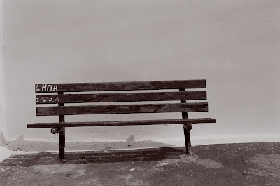
I think the balance in this image is the simplicity of the subject, which is also helped by the limited tonal ranges in the photograph. The small incline in the floor gives a feeling that it is leading you out of the image . The graffiti on the chair is placed on a line of a third which draws in the eye of the viewer. The image is finally set by being in the lower level of the photograph, which makes it feel more isolated and enhances the subject matter.

This photograph has looks un balanced to the eye as there are two people of the left and one on the right. the fact that the image is also divided by a dark foreground and a light background also makes it feel un balanced. I think the image works though as the people a sitting far apart form each other and the single lady is sitting further away from the centre of the image which makes it feel more balanced.

This photograph has a high horizon level which gives the feeling of the balance of this image is all in the lower 2/3rds on the photograph. I think as the horizon level is placed on a line of a third it gives the feeling that there is a greater depth into the image, as you are slightly looking up to the horizon line. The sea barrier gives a feeling of depth too, by running off into the distance. The balance is also helped by the fact that the barrier is placed slightly off centre and comes out of the lower left hand corner.

This photograph again feels un balanced as all the weight in this image is in the lower level with the circular petal dominating the frame. This image works though again on its simplicity and the contrast in the shapes formed by the petals, a long straight line at the top and a circular shape at eh bottom. If ti had been the other way around I think the image would look too top heavy as if it was going to fall over as all the weight of the image would have been at the top of the frame.

This image represents balance by the repetition of shape. The photograph is balanced by the rounded shape of the tomatoes against the triangular shape of the stalks that contrast against each other. This is further enhanced by the contrast in there colours. The viewer is also looking up into the image which gives it a sense of depth. I also think the balanced is helped by using three subjects. It is better to choose three or five or seven than even numbered objects.
LEARNING NOTES/COMMENTS
LOOK AT BALANCE WHEN COMPOSING A IMAGE. LOOK FOR WEIGHT BOTH HORIZONTALLY AND VERTICALLY

No comments:
Post a Comment
Note: only a member of this blog may post a comment.