3.BP.BLOGSPOT.COM
CONTRAST COLOURS NEW SUBMISSION
THIS KIND OF COMBINATION AS STRONG CONTRAST AND MIGHT BE CONSIDERED THAT
THEY CLASS WITH EACH OTHER
This image is an example showing contrast of colour
Taken at Camden Underground Tube Station, I focused
on the sign and set the exposure level to ensure I
could capture the writing sharply. I then waited for the
train to arrive and then started shooting. I am really
pleased with this image.

A very true interpretation of the theme contrast colour
as red and blue sit opposite on the colour wheel.
f5.6 1/60 sec
I saw this image walking back to the train station after
visiting Columbia Road Market.
A man was selling some old clothes and he had hung this coat
against the fencing behind him. I felt quite moved taking this image
as it was pretty obvious this man had nothing..I saw this coat as a
photo opportunity and he saw this coat as maybe a way of making
some extra money.
This very simple composition shows the contrast between
then tonal terracotta walls and door frame
and the very bright blue window shutters.
f5 1/125 sec
Taken in the historic Spitifield area of London
The above photograph shows the contrast between the colours
on each separate building again the colours are primary colours
that oppose each other but what unifies this image is the
repetitive shapes of each window.
f6.3 1/60 sec
I was walking back to the station making my way home from
a disappointing day shooting when I looked up and saw this derelict
building and noticed the contrast immediately.Since taking this image
the building has been knocked down
COLOUR ACCENTS NEW SUBMISSIONS
A SMALL AREA OF COLOUR SITS AGAINST A MUCH LARGER AGAINST A BACKGROUND
OF ANOTHER COLOUR AS A SPOT OR ACCENT
a accent colour.
1 studio flash light, silver reflector
1/60 sec f4.5
I set this studio set up and shot the flower head
against a red backdrop. I used depth of field to
reduce the focus area to show only small areas of
sharpness on the central area of the flower.
This image shows and example of an accent colour
1/60 sec f4.5
This photograph shows the accent colour of
the orange leaf
against the frozen lake in London’s Hyde Park.
I noticed the
frozen leaf in the lake from a distance.
When I moved closer I saw that the ice
had changed
the colours of the lake
into different tonal ranges of blue.
I repositioned myself and the camera to place
the
leaf at a point of a third to make the
leaf colour
accent stand out more.

This image is an example of an accent colour
1/60sec f7.1
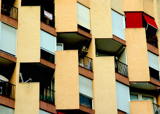
I took this image whilst on a travel holiday in spain.
I looked at the contrast of the shapes of the apartment
block but then noticed only one flat had its shutters down.
I positioned myself so that I could capture the full colour
contast.
Image showing the accent colour of the red luck
card against the green tones of the door and the
poster
1/50sec f8
taken in china town on New year day, The Chinese
dragon was making its way down the street and the
shop owner put cards and food in its door to
receive a good luck blessing from the dragon
COLOUR HARMONY- NEW SUBMISSION
THOSE COLOURS THAT SIT NEAR EACH OTHER AS IN COOL OR WARM
RANGE OF COLOURS
A simple image showing the many tonal ranges of the hue green.
This image is an example ofcolour harmony.
f4.5 1/60 sec
I took this image at an ornamental pool near Liverpool Street station.
It was an un planned image as the subject was not really right for this
assignment. It was not until I started taken the photograph to I noticed
the tonal ranges and that the colours were harmonious. I changed
my viewpoint to capture the reflection of the office block beside the pool.
I think the shadow of the office block adds some depth to the photograph
and also brings in some darker shades of green. The light was very limited so
I had to select a wider aperture. I would have preferred a smaller aperture
to improve sharpness of the image
This image is an example of colour harmony. The blue bridge merges tonal with
the blue sky
f7 1/160 sec
I took this image when shooting assignment one. It was such a beautiful spring day
and the sky was cloud free. The blue bridge seemed to merge with the sky.
I planned to shot the image diagonally to make a more dynamic composition. I like
the various tones of blue on the bridge where the graffiti has been painted out
which adds to the image.
This image represents harmonized colours of the
background and the tones of the gentleman's outfit
1/25sec f 4.5.
I was walking through china town as I planned
to take images as it was Chinese new year and the
area was full of decorations which was a great source
of images for this assignment. I noticed this man leaning
against the wall and realized that the tones of clothing that
he was wearing harmonized with the back ground. I would
have like to have changed the angle to have moved around
the bollard in the foreground.

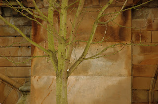
This photograph shows the harmonious colours of a young tree
against an ancient bridge in Hyde Park London.
against an ancient bridge in Hyde Park London.
f4.5 1/80 sec
I planned a trip to Hyde Park as it is close to my office.
I saw the bridge in the distant and noticed that it was weathered.
When I got closer I noticed the tree and how tonally they merged together.
The lighting conditions were perfect as the cloud cover improved the
saturation of the colours. I experimented with white balance levels and this
image was taken with the white balance set to cloudy which is added more
warmness to the image enhancing the overall tonal levels.
COLOUR COMPLEMENTARY COLOURS
COLOURS THAT FACE EACH OTHER ACROSS THE COLOUR WHEEL
colours of purple and yellow
ISO 200
F5.6. 1/60SEC
IRIS
I found this section of the assignment
harder to represent
as an image. My tutor asked me to review
this segment and whilst researching I
looked at the colours
that faced each other on the colour wheel.
The obvious choice for purple and yellow
is the iris.
an image to represent the complemtary colours of
red and green
1 soft box overhead, 1 silver reflector
1/60sec f10
red and green face each other on colour wheel
sunset shot on Southwold beach showing the complementary
tones of purple sky and yellow sandy beach
f/10 sec f/16
I took this slow shutter speed shot on a tripod as sun
was setting on Southwold beach. The tones of the
purple sky complement the yellow tones of the
sandy beach
Studio set up to show the complementary tones of
orange,blue and green
Studio set up, high key lighting
studio soft box, silver reflector, 1 over exposure level.
1/60sec f 4.5


print.jpg)


No comments:
Post a Comment
Note: only a member of this blog may post a comment.